A company’s logo is the first, and oftentimes most important, visual created. It identifies the brand, making them recognizable to their consumers in a memorable way. It is a visual representation of you –a crucial first impression for your customers. Research even shows that people make a sub-conscious judgment about a product within 90 seconds of initial viewing.
So how do you design a logo that will explain what you do, without any explanation, resonate with your target audience and stand the test of time?
Below are our top three logo-design tips guaranteed to make your logo last a lifetime.
Research Your Competition
Who is your comp set? Do your logo homework -research local, national and international companies with similar business models to yours. This will give you a good idea of what’s working and not working in your field.
![]()
Have you ever noticed the arrow pointing right in the FedEx logo (hint: it’s between the “e” and “x”)? Shipping with FedEx gets you your package “on time.”

DHL’s logotype leans to the right, giving the perception of speed and motion. While its predominately yellow color invokes happiness and relaxation. Don’t fret; your package is safe with DHL!

The United States Postal Service’s slightly right-leaning logo eludes to the movement of packages. An eagle was included to make consumers think “reliability” and evoke American pride.
Choose a Style that Represents Your Brand
What do you want your brand to say? If you’re a capitol management company, your logo should present trust, stability and consistency. Be sure you know your brand voice and choose a logo that speaks to it.

Animal Planet chose to replace their elephant-with-globe design for a more eye-catching logotype. As the television channel moved toward more exciting programming, so too did their logo’s design. This new logo was created to represent instinct and “primal animal boldness.”
![]()
Everyone loves ice cream. A trip to the ice cream parlor was one of the most exciting ordinary moments as a kid (and hey, as an adult, too!). Baskin Robbins’ cheery pink-and-blue logo is playful and fun, geared toward bringing back delicious memories, while pulling you back to make more.
![]()
One of the most recognizable logos of all time is Walt Disney’s logotype. Its whimsical interpretation of Walt’s actual signature improved brand recognition for adults and (maybe more importantly) kids alike, turning it into one of today’s biggest and most successful companies.
Create a Design that will Last Longer than the Trends
Your logo will be one of the most important facets of your company. It needs to represent your product now and remain relevant for the entirety of your business. While many go through refreshes in design, the most successful stay true to their original concept. Using simple updates, not drastic redesigns, allows their customers to continue recognizing their brand.
![]()
Not much has changed (or looks like it has changed) for this auto giant BMW. However, BMW’s logo has gone through many subtle redesigns since its founding in 1923. The iconic blue and white circular logo has merely updated its fonts and slightly tweaked its colors.
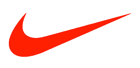
Nike easily has one of the most recognizable logos of all time. 98% of Americans can identify its “swoosh”–and we bet you’re one of them. The Nike “swoosh” became one of the athletic brand’s most important characteristics. Its simple, to-the-point design has been so successful that the original is still in use.
![]()
The American Broadcasting Company’s (ABC) current logo was created in 1961 and featured a simple black circle with lowercase “abc” in Bauhaus font. Its clear design upheld the media company’s concise messaging to its consumers.
Choosing a logo is tough work. Make the design process an open communication between you and your graphic designer. Explain the points you wish to make, your target audience and your company’s central message. Your perfect logo will be created in no time!
More Helpful Hints
- Keep it simple. Don’t lose your message in overly complicated design.
- Color: Like our earlier blog post states, different colors are proven to evoke specific feelings. Consider your audience when choosing your palette.
- Remember, your logo must be able to be displayed in black and white.
Have you seen our logo design?
We think we’d make a perfect pair. 😉